
When a product, service, or brand struggles to communicate its core value or unique selling points, the instinctive reaction is often to add more: more explanations, more bullet points, and more reassurance. While this feels logical on the surface, excessive copy typically leads to a fragmented distribution of information rather than a lack of it. In today’s digital landscape, users do not read in the traditional sense; they scan, skim, and decide within seconds whether an interface feels intuitive or overwhelming. Faced with dense blocks of text, users rarely feel better informed. Instead, they feel a sense of uncertainty, which remains the fastest way to erode attention, trust, and ultimately, conversion.
This challenge is magnified in global markets. When brands rely heavily on text to define their identity, they introduce friction across various languages, cultures, and reading habits. What appears concise in one language may feel bloated or confusing in another, making the message increasingly fragile as it scales internationally. High-performing brands understand this instinctively. Rather than aiming to say everything, they strive to make understanding effortless. Their interfaces feel obvious and their messages confident, often utilizing surprisingly minimal copy. This brevity does not stem from a lack of depth, but from the fact that clarity has been intentionally designed into the experience itself.
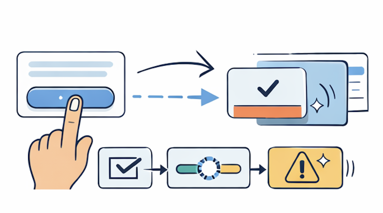
Too much copy is frequently used to compensate for a weak structural foundation. If a user must read a paragraph to understand the result of a button click, or if onboarding requires multiple screens of instruction, the interaction itself is failing to do the heavy lifting. In these instances, adding more words only amplifies the underlying problem. This is where motion becomes essential, possessing the unique ability to replace explanation with direct understanding. Subtle transitions can communicate cause and effect, micro-interactions can confirm intent, and progressive reveals can guide attention without the need for manual instruction. Rather than telling users what is happening, motion shows them, instantly and intuitively. Simplifying copy is not about removing information; it is about redistributing meaning. When motion, layout, and interaction carry the weight of the message, copy becomes lighter and more intentional, emphasizing the words that truly matter. The final result is not silence, but a profound sense of confidence.

The most effective interfaces rarely explain themselves; they demonstrate. In this context, motion transcends decoration to become a functional tool. It transforms abstract intent into visible cause and effect, allowing users to grasp the logic of a system without being explicitly told. While text explains what a feature is, motion explains how it works visually.
When a button subtly compresses upon being tapped, a screen slides in from the direction of movement, or elements appear progressively rather than all at once, the interface is communicating its internal logic. These moments significantly reduce cognitive load because the user no longer needs to translate written instructions into mental action; the system already speaks their language. This transition is vital when simplifying copy, as removing text without replacing its function leads to confusion. However, when motion is introduced intentionally, it absorbs the responsibility previously held by text. Transitions clarify hierarchy, timing establishes priority, and spatial movement creates relationships between elements, allowing what would normally require a full sentence to be communicated in a fraction of a second.
Onboarding serves as a primary example of this principle. While many products rely on multi-step tutorials, the strongest experiences allow users to learn through action. A well-timed animated nudge or a contextual transition can explain a feature more effectively than a paragraph ever could. Motion also plays a critical role in feedback; users do not need text to inform them whether an action succeeded, failed, or is still processing. They feel it through a responsive loader or a gentle shake signaling an error, providing reassurance without interrupting the flow. In global products, this becomes even more powerful because motion operates beyond language. While copy must be localized and culturally adjusted, motion communicates through universal patterns of acceleration, rhythm, and direction. By redistributing meaning, motion allows copy to become sharper and more human, leaving the mechanics to the movement itself.
Simplifying copy is not an exercise in minimalism for its own sake; it is a strategic effort to reduce cognitive friction at the exact moments where users decide whether to trust or abandon a journey. Every digital product creates a series of micro-decisions regarding understanding, safety, and progress. If any of these questions require conscious effort, friction is introduced, which inevitably slows users down and erodes conversion rates.
Trust is often the first measurable outcome to improve. Users do not build trust because a product explains itself well, but because it behaves predictably. Motion reinforces this predictability through immediate responses and transitions that confirm progress, replacing explanatory copy with experiential certainty. Consequently, the interface feels responsive and reliable - qualities instinctively associated with credibility. Conversion follows naturally from this momentum. When users aren't forced to stop and interpret instructions, motion-guided attention helps them focus on the essential steps of the journey. Progressive reveals prevent information overload, while directional transitions guide the eye so that calls to action feel obvious rather than persuasive.
This approach is indispensable for global scaling. As products expand, copy becomes fragile due to language nuances and translation limits. Motion, however, scales with far less friction. The fewer words an experience depends on, the easier it is to adapt across markets without losing clarity. This is why successful global products often appear understated; their interfaces demonstrate rather than explain. Ultimately, distributing communication - where words handle meaning and motion handles understanding - strengthens trust and enables growth without adding noise.

Great experiences are defined not by how much they communicate, but by how intentionally they remain silent. The most difficult part of simplifying copy is deciding which explanations should disappear entirely. When teams rely too heavily on text, it is often a signal that the design itself isn't doing enough of the work. Extra copy becomes a patch for unclear hierarchy or confusing flows - patches that become unnecessary once motion is integrated as a core system component.
Motion allows teams to design intention instead of describing it. For instance, instead of explicitly stating that changes have been saved, the interface can confirm this through a responsive transition. Rather than explaining navigation, the layout can guide the user spatially, and instead of warning users about what comes next, motion prepares them cognitively. This requires a fundamental mindset shift from asking what to "tell" the user to asking what the experience should make "obvious."
However, this demands restraint. Not every interaction requires animation, and effective motion is often felt rather than noticed. Its role is to remove doubt, not to draw attention to itself. When motion becomes performative, it competes with clarity; when it is purposeful, it disappears into the experience. This balance is critical as products mature and complexity increases. Motion-backed simplification offers a way to scale without adding noise, acknowledging that understanding should emerge naturally from interaction. When teams design for less, users feel more - they trust more, move faster, and stay longer. This is not just aesthetics; it is clarity as a competitive advantage.