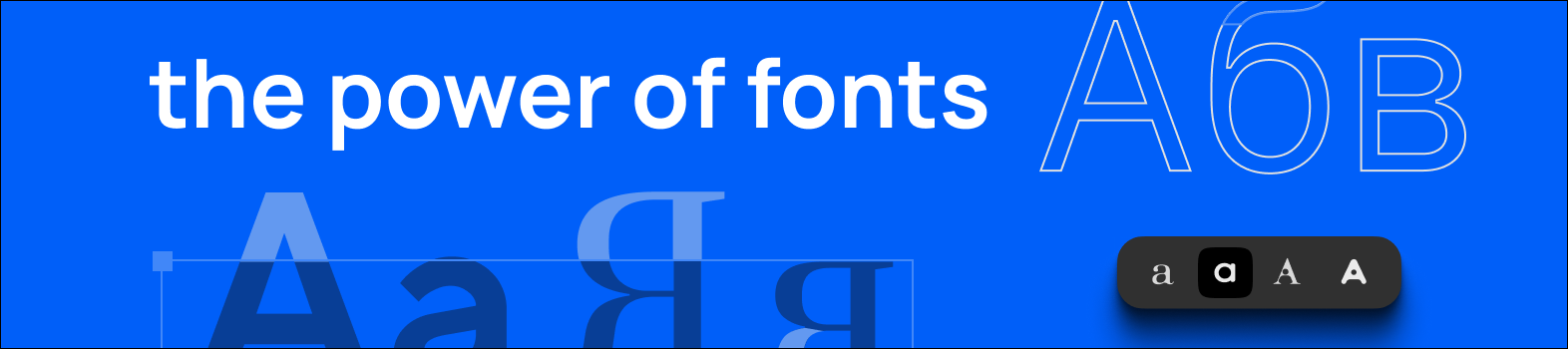
In design, every detail counts. From color palettes and layouts to imagery and fonts, each choice plays a role in how a brand communicates with its audience. Fonts might not always be the first element people notice, but they are often the detail that makes or breaks the design. When chosen thoughtfully, fonts are a powerful tool that can shape perception, spark emotion, and strengthen brand identity.
This article explores why typography matters, how font psychology influences perception, and how you can use it to create visual designs that leave a lasting impression.
Typography is both an art and a science. It is about making written language legible, visually appealing, and consistent with the brand’s voice. A font, as a specific design of letters and characters, is one of the core elements of typography. Fonts are not just aesthetic choices. Each one carries its own personality and can evoke emotions, memories, or cultural associations long before a single word is processed.
Imagine a luxury fashion brand launching a new product line. To convey exclusivity and refinement, they select a sleek, sharp-edged typeface for their campaign materials. The choice instantly communicates sophistication, even before the audience reads a single sentence.
Font psychology is the study of how typefaces influence emotions, perceptions, and behavior. For designers and marketers, it provides a framework for choosing fonts that align with a brand’s goals and values. Here are some of the most common font categories and the feelings they often convey:
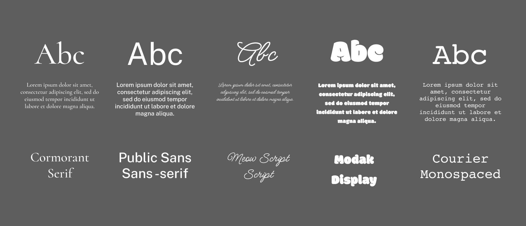
- Serif Fonts: With their decorative strokes, serif fonts are often linked to tradition, trust, and authority. They are frequently used in newspapers, financial institutions, and heritage brands.
- Sans Serif Fonts: Clean, modern, and straightforward, sans serif fonts communicate simplicity and efficiency. They are popular among tech companies and lifestyle brands that value a minimalist aesthetic.
- Script Fonts: Resembling handwriting, script fonts can evoke elegance, creativity, or intimacy. They are ideal for brands that want to emphasize personal connection or artistry.
- Display Fonts: Bold and eye-catching, display fonts are designed to grab attention. They often appear in headlines, logos, or campaign visuals where impact is the priority.
- Monospaced Fonts: With equal spacing for every character, monospaced fonts recall coding and typewriters. They suggest precision, technical skill, and reliability.
Choosing the right font is about more than style. It is about ensuring consistency between the brand’s personality and the audience’s expectations. Here are some practical ways to apply font psychology to your design projects:
- Know Your Brand: Define your core values, tone, and audience. Fonts should reflect these traits to maintain authenticity.
- Select Fonts Strategically: Match fonts to the emotions you want your audience to feel. A healthcare brand may lean toward a stable serif font, while a playful toy brand might choose a whimsical script.
- Create Visual Hierarchy: Use font size, weight, and variation to guide the reader’s eye and highlight important information. This keeps messaging clear and easy to follow.
- Test and Adjust: Conduct A/B testing and gather feedback. Monitor how audiences respond to different font choices and refine when needed.
- Prioritize Legibility: Never sacrifice readability for style. A font should be clear across all platforms, screen sizes, and print formats.
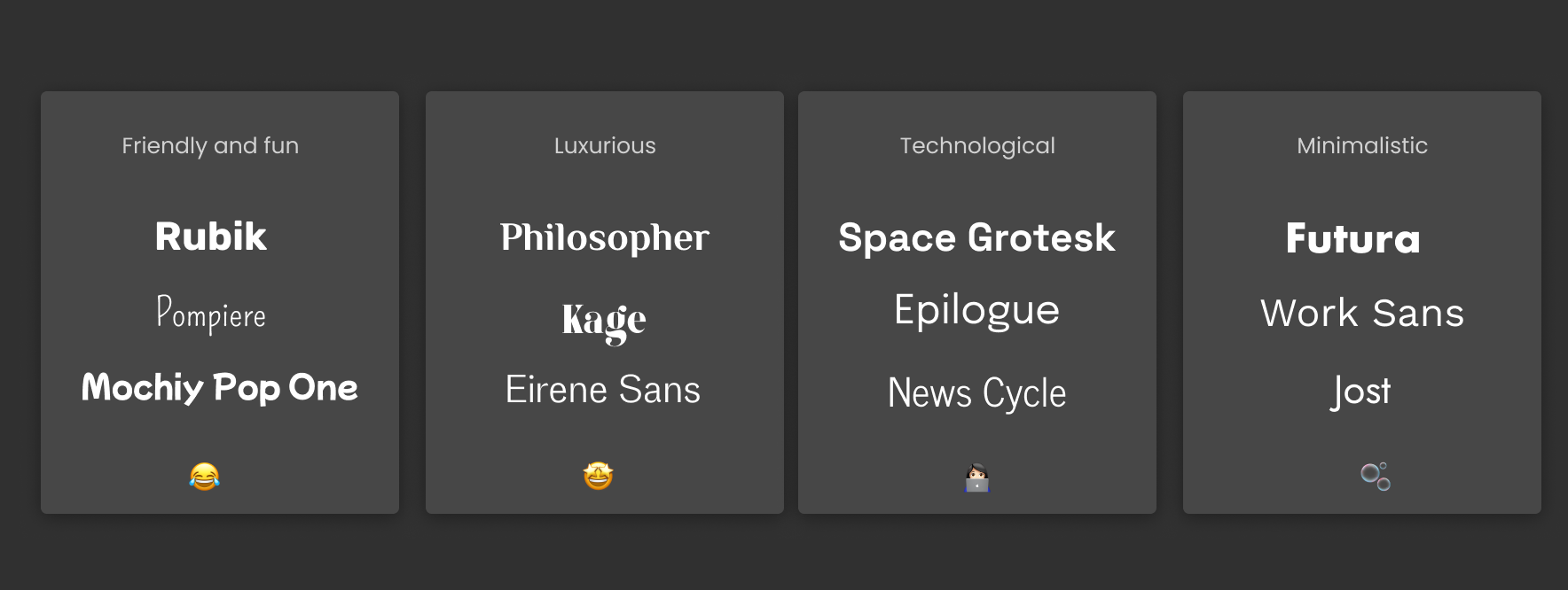
Think about browsing websites for a luxury skincare label, a cutting-edge tech startup, a minimalist lifestyle brand, and a fun beverage company. Without reading a single line of copy, you would likely feel the difference between each one almost immediately.
- The skincare brand might feature a graceful script that radiates elegance and refinement.
- The tech startup could use a sharp sans serif that feels modern and forward-looking.
- The minimalist brand might rely on a clean, understated font that communicates simplicity.
- The beverage company could showcase quirky lettering that sparks joy and playfulness.
These choices show how typography sets the tone and helps audiences connect emotionally with a brand.
Fonts are far more than decorative details. They are powerful tools that shape how people perceive and remember your brand. By understanding font psychology and applying it with intention, you can communicate trust, inspire emotion, and leave a lasting impression.
The next time you start a design project, remember that typography is not just about arranging letters. It is a visual language that speaks volumes about who you are as a brand.